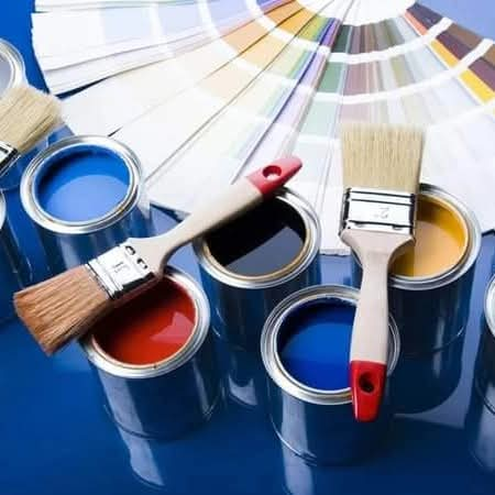
Colors have the power to transform a space and evoke specific emotions. At Madola Interiors, we understand the importance of selecting the right hues to create luxurious, functional, and inviting environments. In this blog, we’ll explore how colors influence mood and behavior, helping you make the perfect choices for your home.
1. Blue: Calm and Focused
Blue is a versatile color known for its calming and serene effect. It works exceptionally well in bedrooms, bathrooms, and offices where relaxation and focus are essential.
Design Tip: Use lighter shades for an airy feel or deeper tones like navy for a sophisticated, high-end look. Pair with neutral accents for balance.
2. Red: Energy and Passion
Red is bold and dynamic, making it ideal for spaces where energy and excitement are desired, such as dining rooms or entertainment areas. However, it’s best used as an accent color to avoid feeling overwhelming.
Design Tip: Combine red with whites or muted tones to create contrast and keep the space balanced.
3. Green: Balance and Refreshment
Green represents nature and is associated with harmony and renewal. It’s an excellent choice for living rooms, kitchens, and home offices.
Design Tip: Incorporate green through plants, fabrics, or wall paint to create a soothing, natural atmosphere.
4. Yellow: Optimism and Warmth
Yellow is cheerful and uplifting, often used in kitchens and breakfast nooks to create a bright, inviting ambiance.
Design Tip: Use softer shades like pastel yellow for warmth or bold yellows for accent pieces like cushions or artwork.
5. White: Purity and Elegance
White is timeless and versatile, creating a clean, spacious feel. It’s perfect for modern, minimalist, or Scandinavian-inspired interiors.
Design Tip: Pair white with textures (e.g., wood or stone) and metallic accents for a high-end finish.
6. Gray: Sophistication and Neutrality
Gray is a popular neutral color that exudes sophistication. It works well as a backdrop in living rooms, bedrooms, and even kitchens.
Design Tip: Combine light and dark shades of gray for depth and mix with vibrant colors like yellow or teal for contrast.
7. Black: Drama and Luxury
Black is bold, dramatic, and elegant, often used in high-end interiors to create depth and contrast. It’s perfect for feature walls, furniture, or decor elements.
Design Tip: Use black sparingly and pair with metallics like gold or silver for a luxurious feel.
8. Purple: Creativity and Royalty
Purple, especially deep shades like plum or amethyst, adds a touch of luxury and creativity to any space. It’s great for bedrooms or lounges where you want a regal feel.
Design Tip: Pair purple with soft neutrals to tone down its intensity while maintaining its elegance.
9. Orange: Energy and Enthusiasm
Orange combines the warmth of red and the cheerfulness of yellow, making it ideal for workout spaces or playrooms.
Design Tip: Use muted oranges like terracotta for a sophisticated twist on this energetic color.
10. Brown: Comfort and Earthiness
Brown tones, like chocolate or tan, bring warmth and comfort to interiors. They’re excellent for creating a cozy atmosphere in living rooms or dens.
Design Tip: Use brown in furniture or flooring, complemented by lighter shades for contrast.
How Madola Interiors Can Help
At Madola Interiors, we specialize in selecting colors that elevate spaces, suit your lifestyle, and reflect your personality. Whether you’re renovating or starting from scratch, our team will help you create a cohesive color palette that enhances your home’s design and functionality.
Contact us today to begin transforming your space with the perfect colors!